Just What Is On That Alfa Romeo Logo?
 Automotive manufacturers’ logos come in a range of styles, ranging from the simple (e.g. the stylized signature of the founder for Ford or the three diamonds of Mitsubishi – which means something like “three diamonds” in Japanese) through to more complicated designs (think of the helmet and lion of HSV, the double dragon of Ssangyong or the Pleiades constellation of Subaru). One of the more complicated designs that is deliberately reminiscent – and in fact borrows from – the old heraldic logos is that of Alfa Romeo .
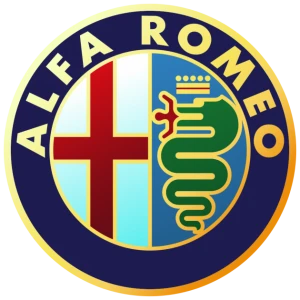
Alfa Romeo has been making classy cars for over 100 years now (the company was founded in 1910) and the logo has only changed subtly over the years (not counting the badges on models from the World War 2, era, which have minimal colour thanks to wartime restrictions). Various small elements and the word “Milano” have come and gone, but the fundamental logo has remained the same. You know the one: the circle with a design on both halves.
On the left-hand half, you have a red cross on a white field, also known as an English cross or even St George’s cross. It’s also known as the emblem of the Crusaders. You know the ones: the guys that got to be the heroes in most adventure stories set in the Middle Ages, starting from the Middle Ages themselves until a couple of decades ago. It’s also the official flag of Milan, which used to be the capital of Lombardy, an independent nation in its own right. In fact, Milan had the red cross on a white field long before the Crusades, as this was the symbol of the patron saint of Milan, St Ambrose (who was knocking around in the fourth century, long before some idiot decided that the Crusades were a good idea).
On the other half you have… what the heck? At first glance, it looks like a crowned snake with what is either a red triple-forked tongue or dragonish flames coming out of its mouth. On closer inspection, what’s in the snake’s mouth turns out to be human torso with arms raised. It looks as though the snake is eating that person. It’s more obvious in the post-2015 logo in the USA, which has been changed to white (green and white and a Slytherin serpent – how very Harry Potter). What is that all about? Dragons: fair enough; Ssangyong has them and they fall into the “cool dangerous animal” category that lots of car manufacturers and brand designers love to draw on. But why would you have a logo that shows someone being swallowed by a snake or a dragon?
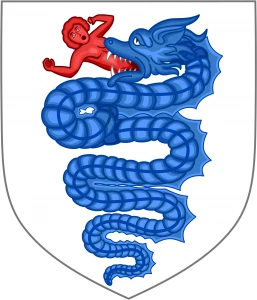
The arms of the House of Visconti.
Alfa Romeo provides a brief explanation: this device, along with the red cross, was part of the coat of arms for the Duchy of Milan (Alfa Romeo was founded in Milan, in case you were wondering what the obsession with Milan was). This was the symbol of the House of Visconti, although the Visconti coat of arms has a blue and white crowned serpent and a flesh-coloured bloke in its mouth. This is presented along with the motto “Vipereos mores non violabo”, which can be roughly translated as “I will not violate the traditions of the serpent”, which really does sound like something JK Rowling made up. The serpent in question is known as the “biscione” and the human is described as either a child or (the even less PC version) a Saracen or Moor. The Saracens and Moors were the enemies of the House of Visconti at the time and they were practically sitting on the back doorstep of Milan, so the device acted as a kind of warning label: mess with us and we’ll devour you. A more colourful legend tells of one of the Visconti ancestors killing a man-eating snake/dragon, which kind of goes with the St George’s cross – that’s St George as in the guy who killed the dragon and rescued the princess (and was, ironically, Turkish).
![]() Another explanation that has been reported out there (possibly by Alfa Romeo themselves) is that the person is coming out of the snake rather than going in, kind of like Jonah coming out of the belly of the whale or something similar – all very Joseph Campbell and the Hero With A Thousand Faces and that sort of thing, where the Hero on his Journey goes into then returns from the underworld or the belly of the beast. Explanations of this type tend to use words like “ouroboros” and “chthonic” and then start to ramble on about various serpent figures in mythologies from around the world. What this has to do with cars or with the ancient Duchy of Milan, I’m not sure. Perhaps it’s because the experience of driving an Italian sports car makes you feel rejuvenated and reborn? Or maybe it’s simply the very understandable wish to disassociate this rather prestigious line of vehicles from the unpleasant combination of Crusader cross and something eating a Saracen (incidentally, the website for Alfa Romeo Middle East conspicuously lacks the coat of arms… I wonder why!)
Another explanation that has been reported out there (possibly by Alfa Romeo themselves) is that the person is coming out of the snake rather than going in, kind of like Jonah coming out of the belly of the whale or something similar – all very Joseph Campbell and the Hero With A Thousand Faces and that sort of thing, where the Hero on his Journey goes into then returns from the underworld or the belly of the beast. Explanations of this type tend to use words like “ouroboros” and “chthonic” and then start to ramble on about various serpent figures in mythologies from around the world. What this has to do with cars or with the ancient Duchy of Milan, I’m not sure. Perhaps it’s because the experience of driving an Italian sports car makes you feel rejuvenated and reborn? Or maybe it’s simply the very understandable wish to disassociate this rather prestigious line of vehicles from the unpleasant combination of Crusader cross and something eating a Saracen (incidentally, the website for Alfa Romeo Middle East conspicuously lacks the coat of arms… I wonder why!)
Alfa Romeo also uses a green four-leafed clover on a white field, known as the quadrifoglio, which means “four-leafed clover”. This means exactly what you think it does: it’s a good luck charm and was adopted in the 1920s when an Alfa racing driver wanted to overcome his run of bad luck. The green and white livery and the serpentine associations might look like they inspired the Slytherin logo but this is probably coincidence: JK Rowling doesn’t drive a car.
For myself, I think I’m going to just enjoy the fact that a logo that was once carried by a knight mounted on horseback is now on the modern equivalent of a speedy warhorse, thanks to the Milanese origins of Alfa Romeo – and I’ll also enjoy the fantasy tale about the dragon-slayer. I’ll also enjoy getting behind the wheel of an Alfa when I get the chance.
Roger Hawcroft says:
Thank you for this information. I’ve been a fan of sports racing cars and Formula 1 since about 1953 when I was 6. Those were the most exciting days in motor-sport. Not burdened by a multitude of niggling and petty restrictions and spurred on by the desire to build a reputation for their brands or simply the desire to complete, there were both factory and private entrants and you could actually see the drivers working in the cockpit, whereas today the cars might well be driven by robots and probably soon will be.
I loved the magic of it all then and the exotic names, such as Fangio, Nuvolari, Ascari and etc. and the amount of innovation and differences in the cars as teams tried to find that little advantage. The sports racing car series such as the Mille Miglia and Le Mans were spectacular and didn’t exclude the enthusiastic amateur. Indeed, some of the cars were actually driven on the road to get to the track.
People would think that I was stupid because we had no television then and I would listen to the races broadcast on the radio.
I’ve always loved the Alfas. I really like the well balanced shape of the 60’s Guilia. One of the nicest looking GT cars ever, in my opinion. I always wondered what was behind the Alfa badge but never thought to find out [Duh] – I guess I just thought it looked neat.
Anyway, just wanted to thank whoever asked and you for answering.
January 25th, 2018 at 1:00 pm